Usability - Best practice for UX design
Seven immortal rules to guide early concepts and designs.
Things we take for granted don't always happen by chance, they happen by design. Well designed buildings affect peoples' lives and well designed websites have an impact on sales. Good design isn't only about good looks than it is about making things usable and useful. Usability goes beyond sales, it determines how we use products or interfaces and interact with them. Whatever the objectives are, users won't stay on a website or application for long without good content and usability in place.
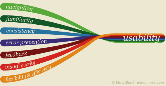
Usability is normally looked at after specific users, their goals and their context have been identified. There is no general rule that can be applied to all users and all tasks. Every company has their own objectives, certain technical capabilities and unique audiences. Nonetheless there are starting points from which initial assumptions can be created. These have been defined as how easy it is for users to learn to use an interface, how they can effectively accomplish tasks, and how they remember their experience. These UX design objectives can be implemented on a website using the following seven aspects that provide a great framework for best practice.
1. Navigation
Visual cues should be in place that set priorities and guide a user into the desired direction. A user will likely ask 'where am I?' or 'how can I get where I want to go'. Knowing what users expect and organizing the content accordingly is key to good information architecture and UX design.
A fashion retail website for example may be visited by some people for researching trends and by others for buying items. Their aims are vastly different and ideally the site's navigation caters for most user-scenarios. The scenario of the highest business relevance (the buyers in this case) have the highest priority for arranging content. Insight into user behaviour is essential for successful e-commerce and is obtained through user-testing. This brilliant website is one way to test contents even when you only have a low budget.
2. Familiarity
Users' expectations are met when language and visuals are understood and create a sense of trust. People tend to trust what is familiar to them and trust is essential for selling products online, following rather than breaking conventions enhances the sense of familiarity. Following common conventions for the web needs to be combined with creating a point of difference for the brand. That's exactly where the challenge for information architects and designers lies.
Familiarity is also depending on behaviour. How often for example do certain people shop online or how much do they know about payment processes and security. Viewing habits for audiences differ across demographics and industries, there are however elements and conventions that are similar throughout the web. These conventions are known to experienced UX designers or can be elaborated through user-testing. Users can be tested via video and screen capture using this software.
3. Consistency
To create a cohesive experience with the brand the tone of voice and visual language is used consistently across channels. Design follows a brand's desired associations and principles. Ideally a site's performance is predictable, and yet the user experience should bare an element of surprise.
How can this be done? A great example is asos.com where every product is featured with a large product preview panel as well as videos of the product in use. While pictures of the product are expected and taken for granted by users, the video preview dramatically enhances the shopping experience on the site and sets asos.com apart from most competitors.
4. Error Prevention
Visual cues and a clear layout should help preventing errors. Yet when a user mistakenly clicks somewhere wrong or forgets something, it should be easy to recognize, diagnose and recover from an error. Help should be within reach. A simple description panel or self-explanatory icons can indicate a way for correction.
For audiences with disabilities, text-size, red/greens and color contrasts are important. This website can be used to test the colors. Also live texts instead of images or Flash elements are enhancing chances of a website to be read correctly by Google and screen readers for blind people.
5. Feedback
A timely manner of response with a user's interaction vastly enhances a site's usability. Image galleries for example don't need to reload a web page for every click or secondary content can be hidden and expanded upon roll over.
Saving a user's time is not the only objective for giving valuable feedback. User's need to be assured that actions they have taken are clear and can be undone. This can be achieved through establishing intuitive visual cues that highlight relevant areas of focus.
6. Visual Clarity
Arranging content as a means to support optimal consumption can be achieved by following conventions for layouts and site structures that users expect. Also, information is ideally presented in a natural and logical way. User scenarios guide a way for a most likely journey within a site. Visual clarity also lowers barriers to commit to a long-term engagement because it communicates an ease of use and a quick start with no need to prior learning. It creates a sense of attainability for what users may aspire. It makes complex technology simple enough for anyone to use. Clarity and accessibility can be regarded as a supporting value for the brand. Data visualization, for example, can provide visual clarity through making complex data quickly understandable.
7. Flexibility
Visuals can create a lasting memory and rewarding experience. Similar to a visit of a brick and mortar store, an atmosphere created with colors and imagery can make or break an experience. And yet the design should be flexible enough to give a feeling of individuality, i.e. through personalization. In particular this means that data visualization can hint at areas of achievement, i.e. a line that goes from orange towards green, visualizing progress.
Imagery at the end of a user's journey should create an optimistic atmosphere through imagery and use of relevant colours. A good feeling at the end of a journey stimulates return visits, increasing the efficiency of the outcome for users.
